
BangBang
Mandate
Branding
Art Direction
Website
Awards
2x Applied Arts 2017
BANG. A four-year history.
BANG. A rebranding.
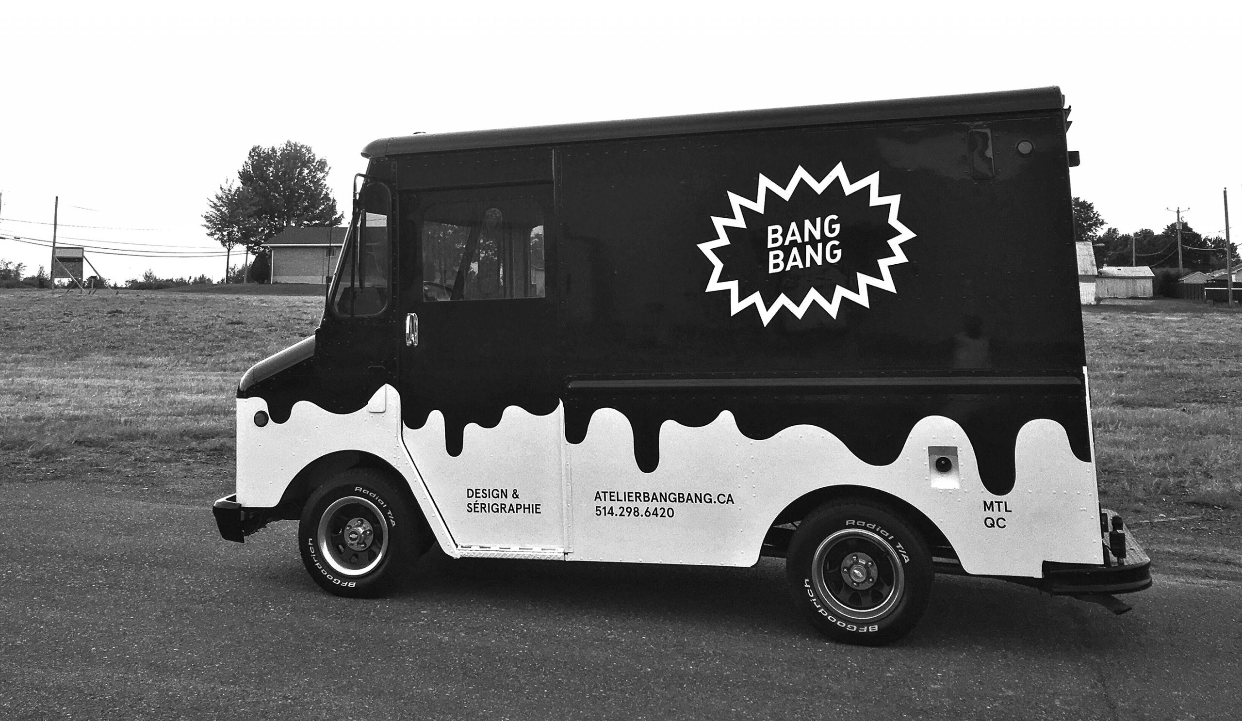
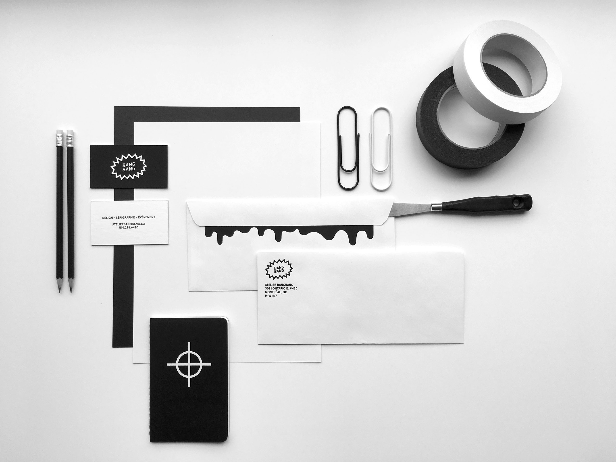
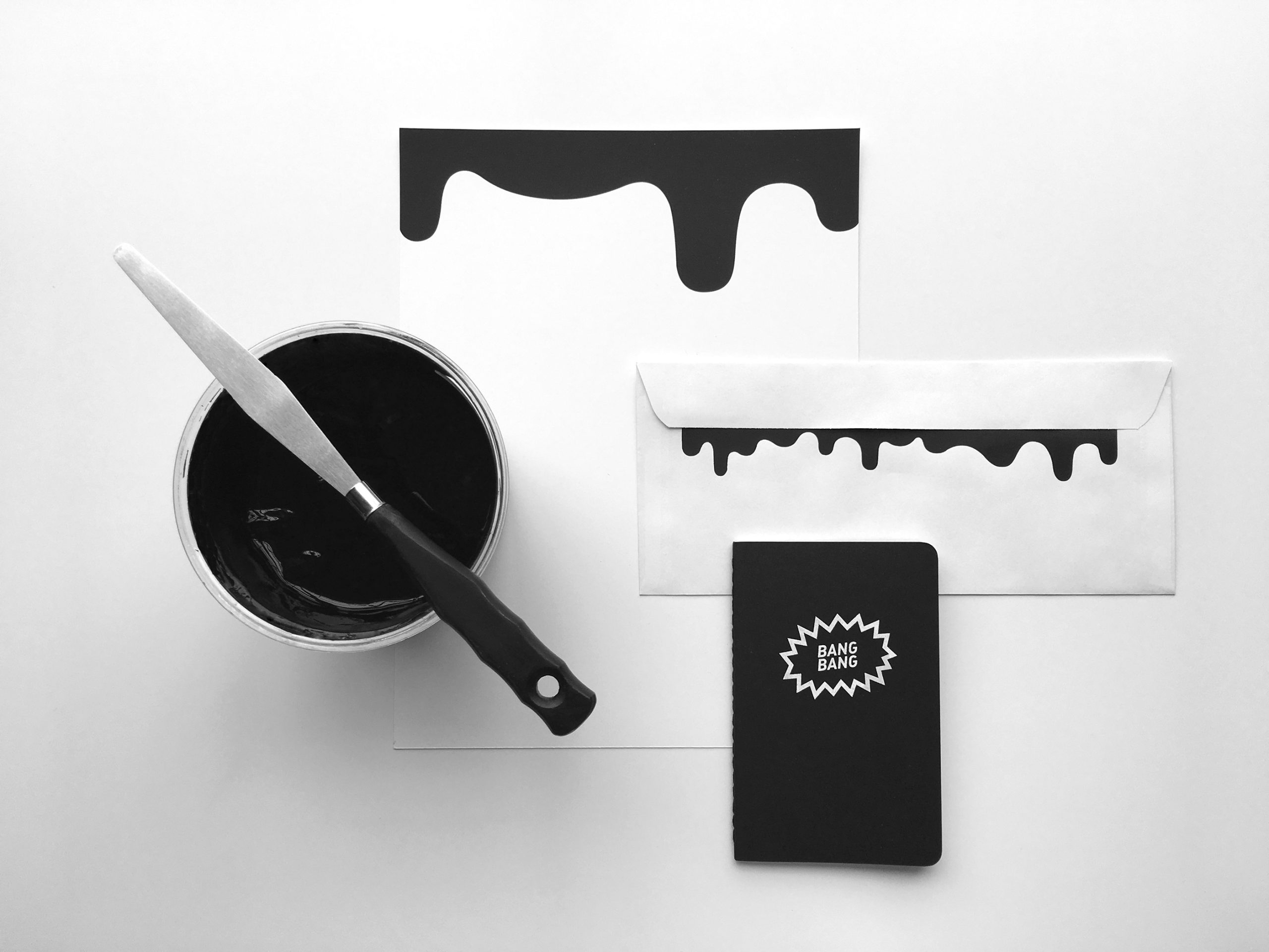
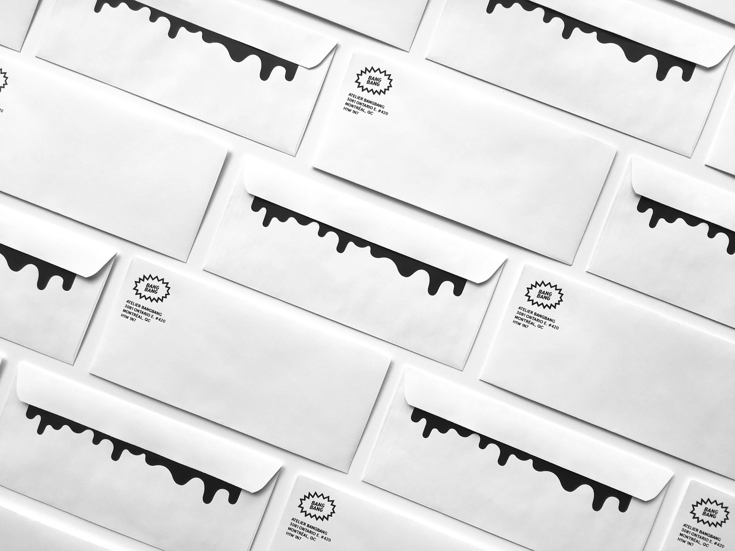
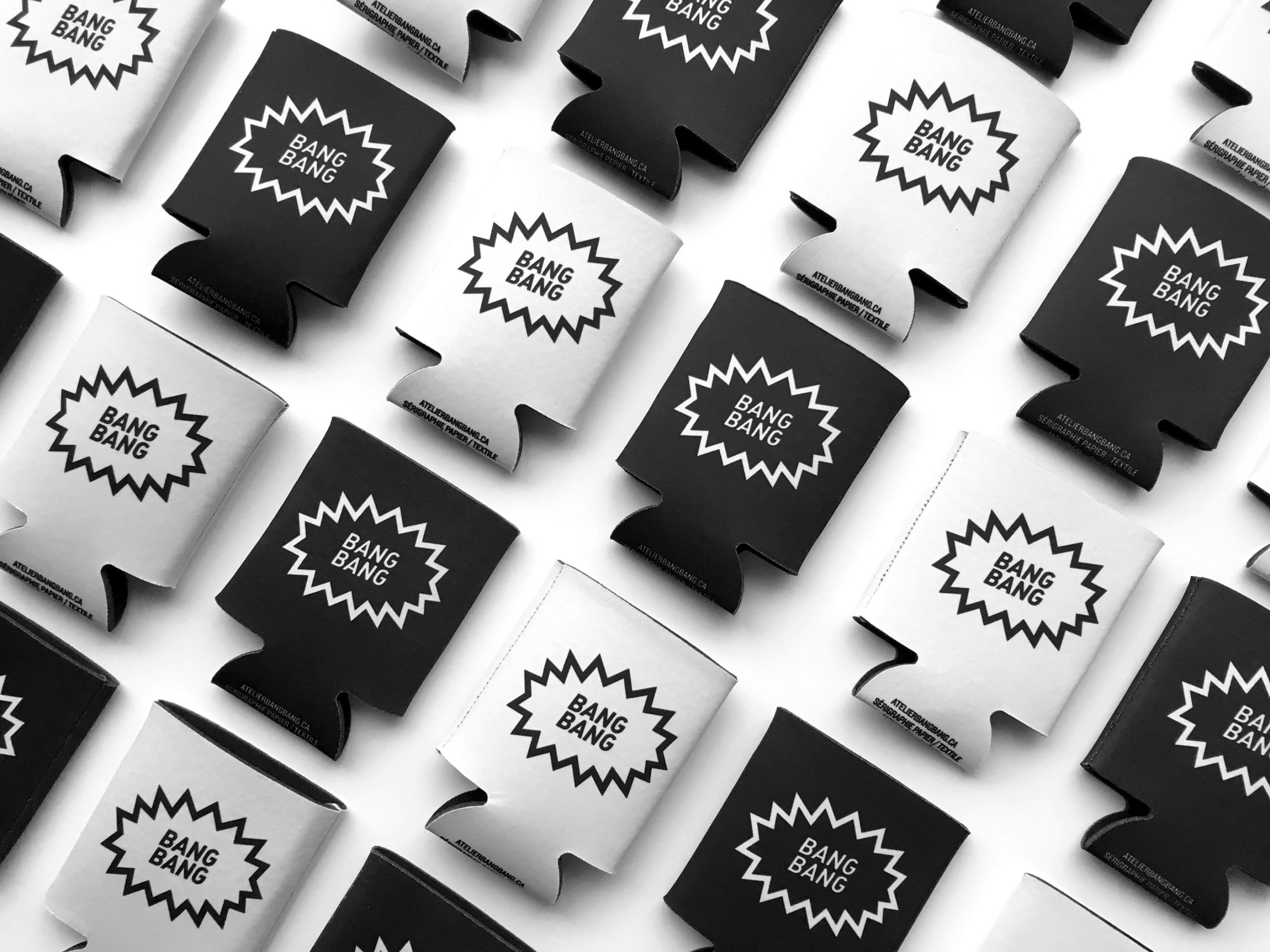
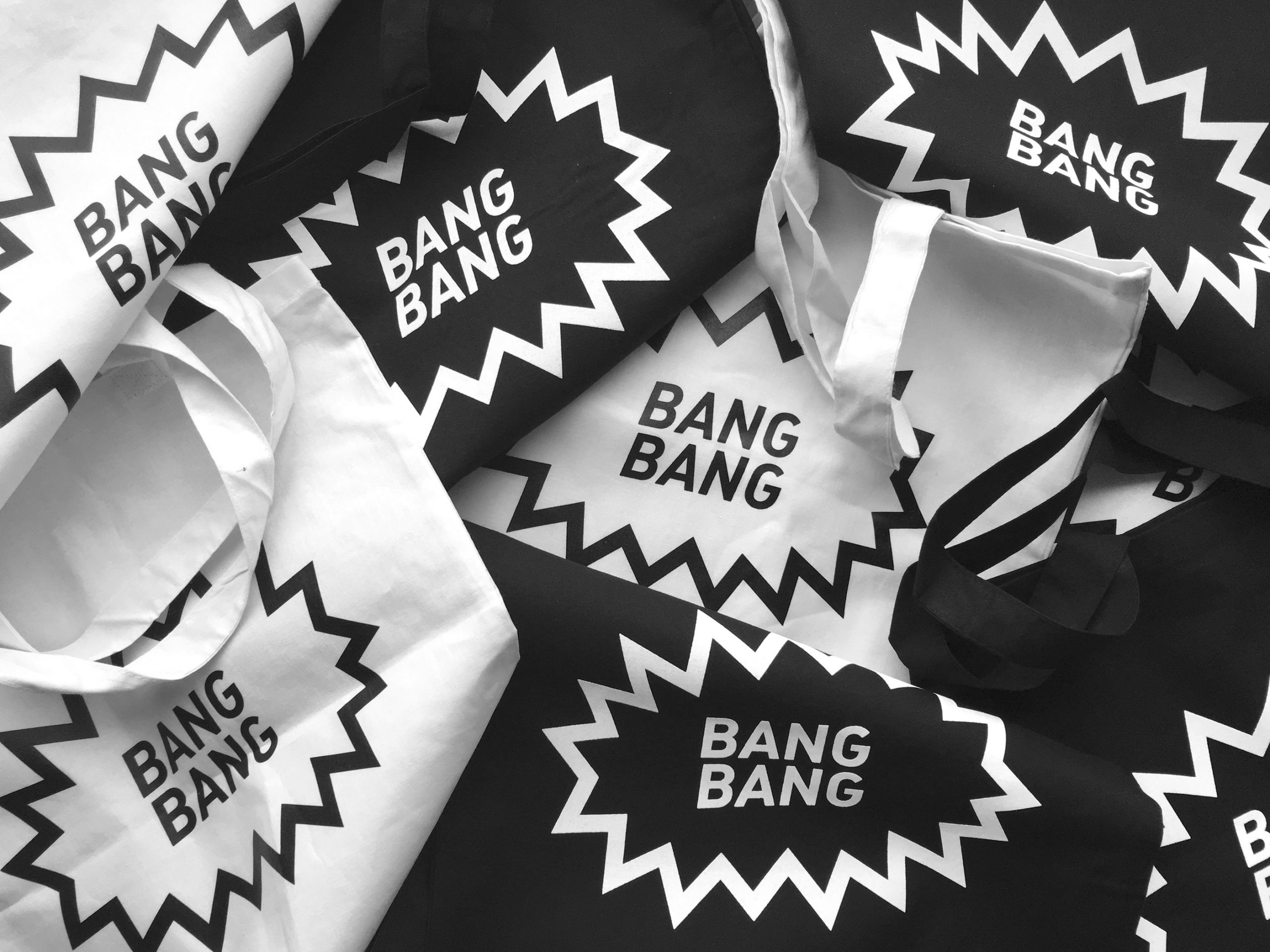
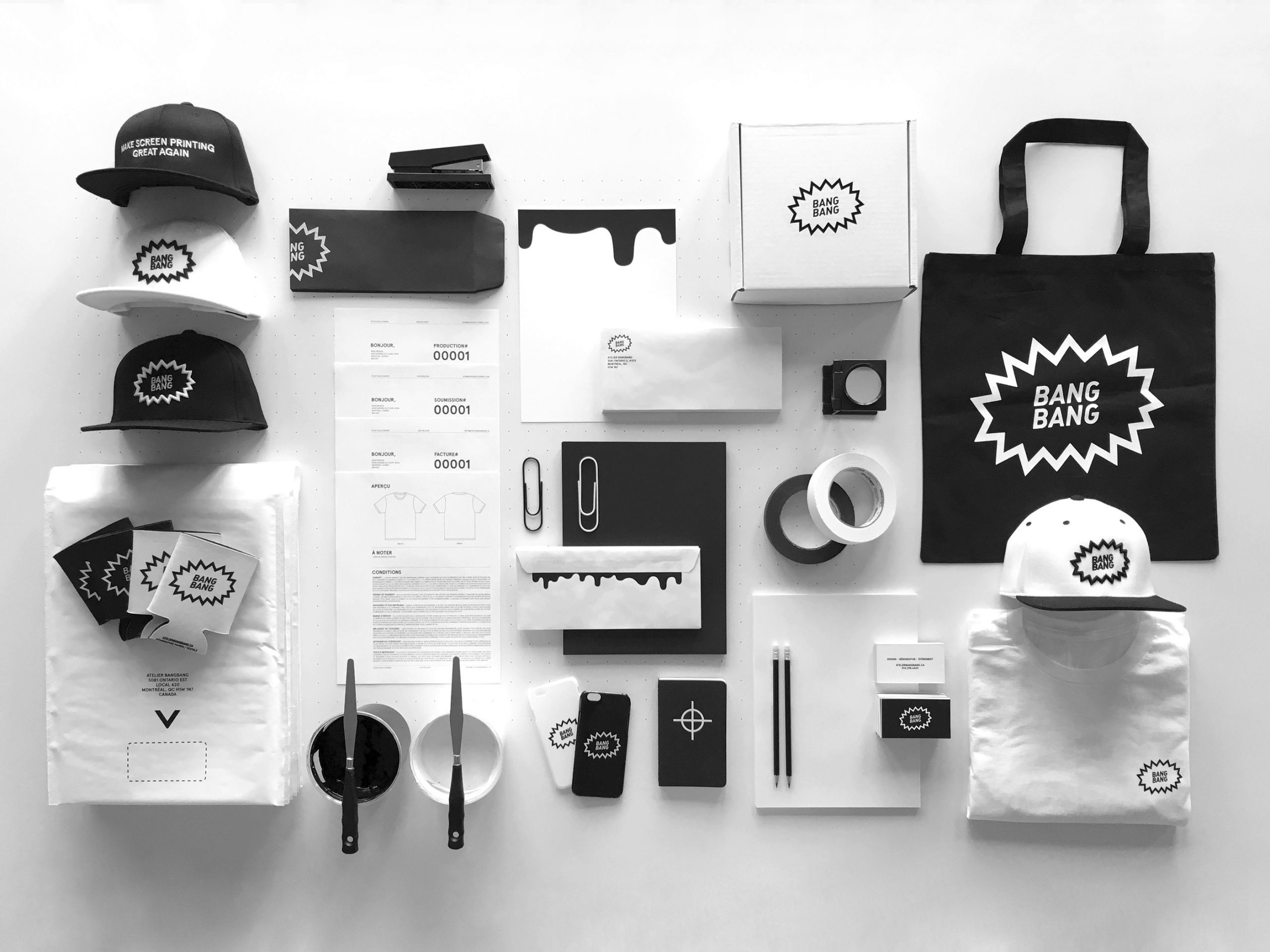
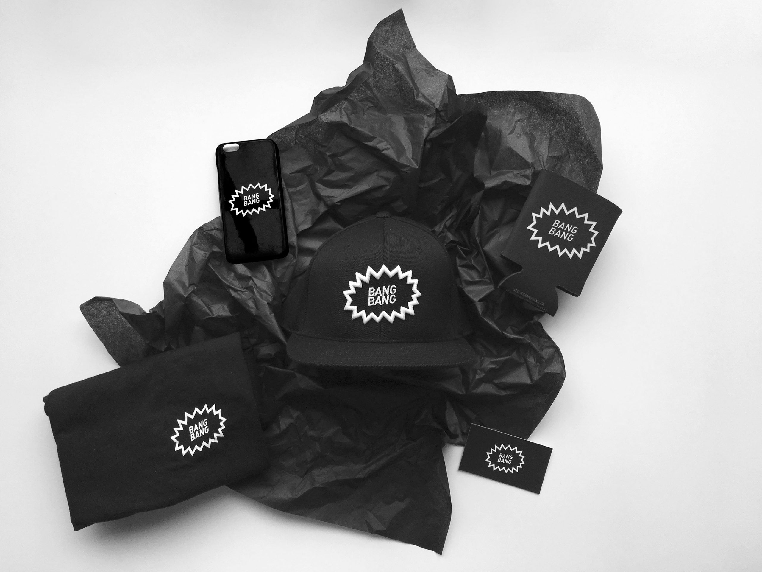
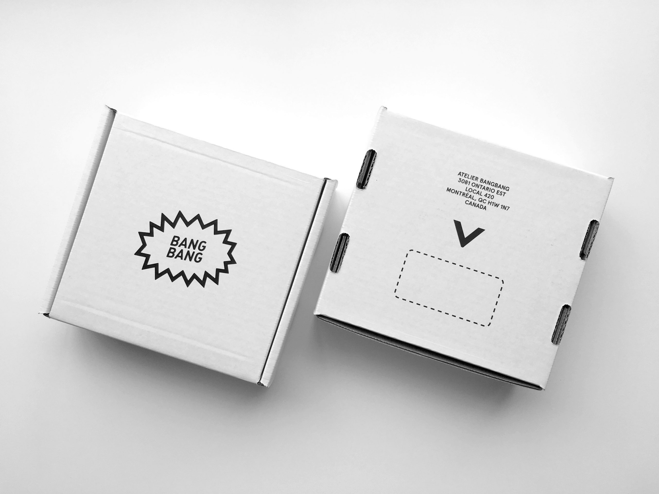
For our four-year anniversary, we decided to freshen up and to polish our visual identity. It seemed logical for the company to shift to a black and white palette in order to allow the creation of our clients’ projects to use colours. From the website to the stationery and merchandise, our promotional vehicle was the real outcome of the revamp.
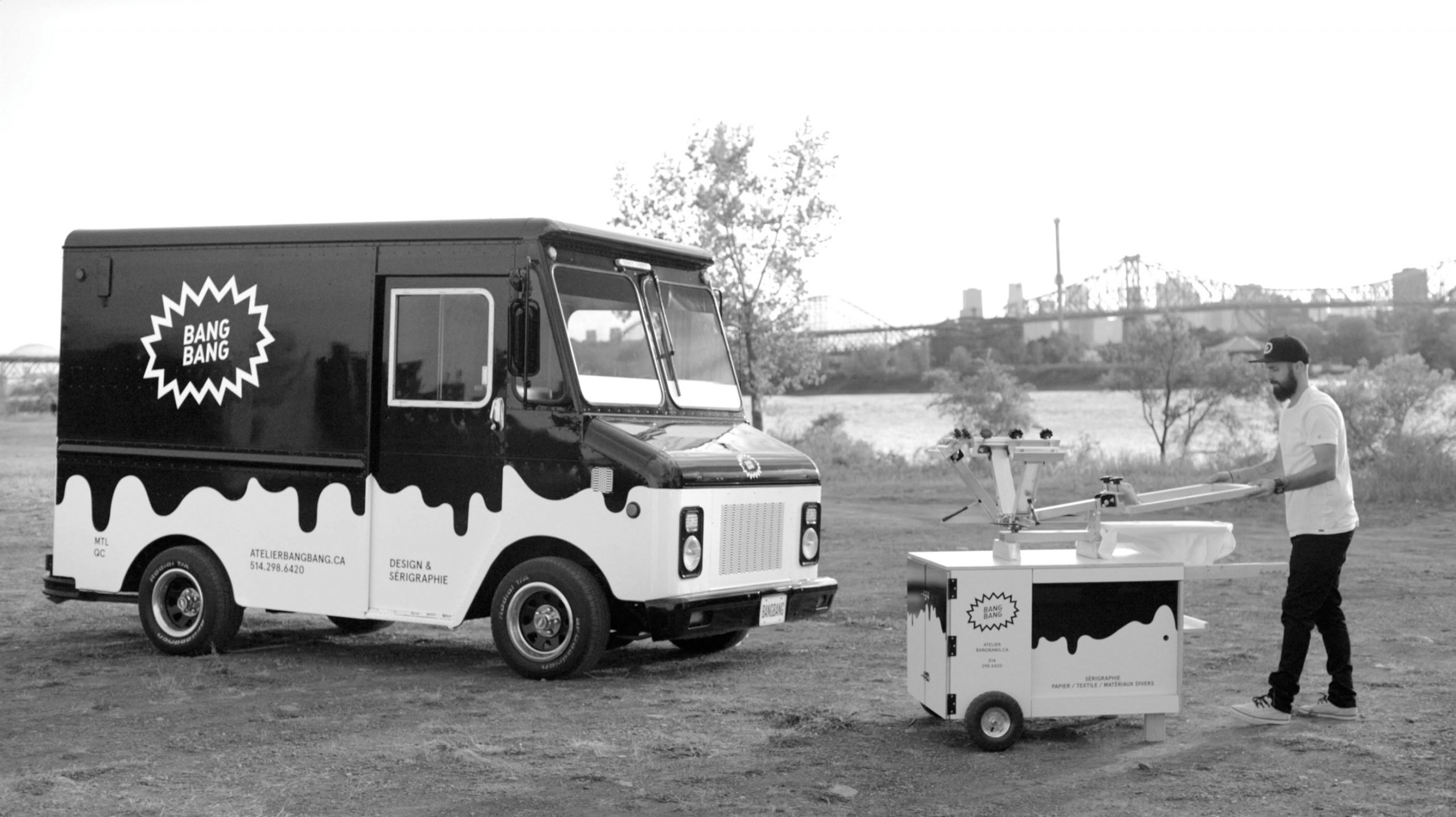
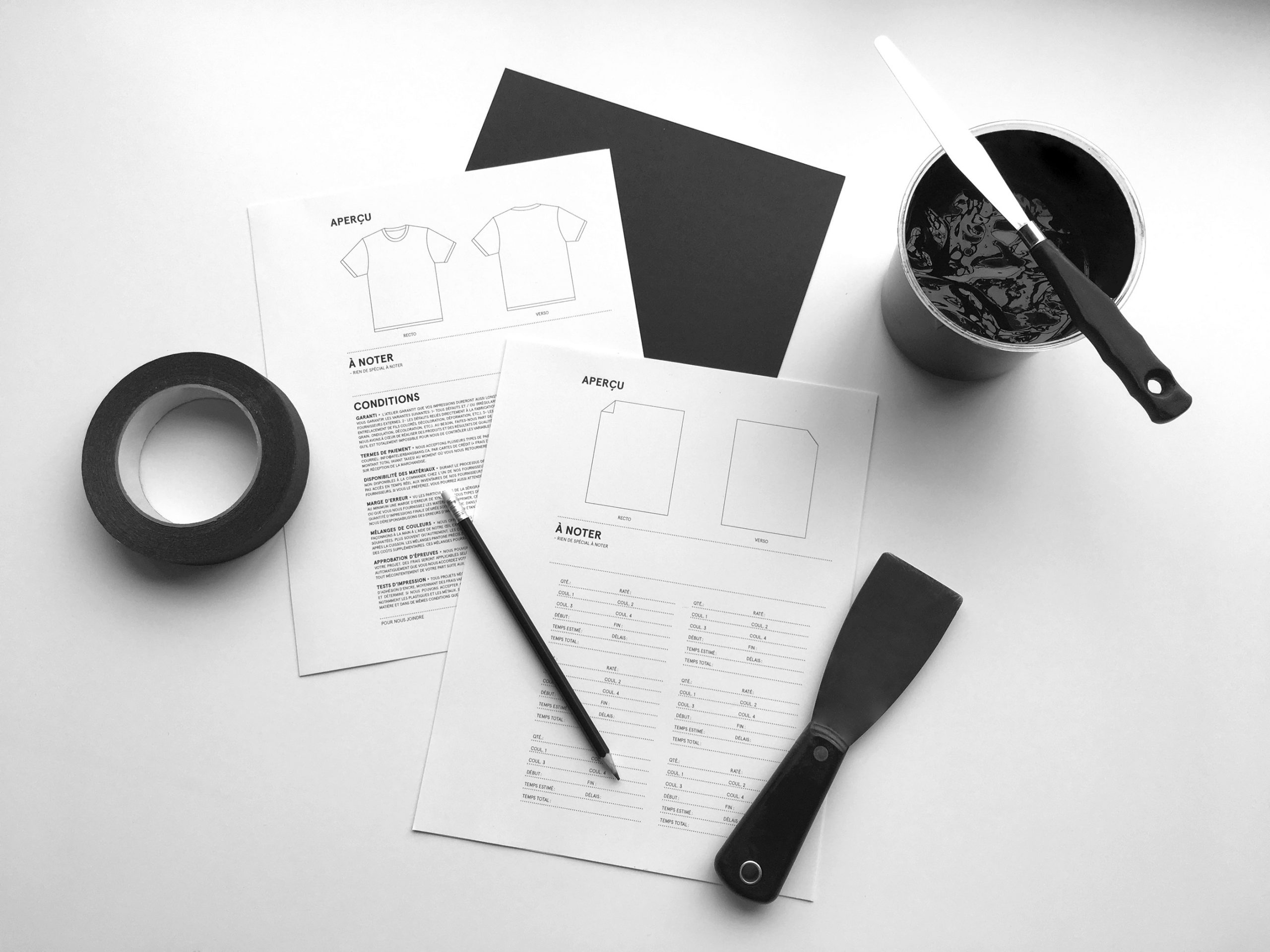
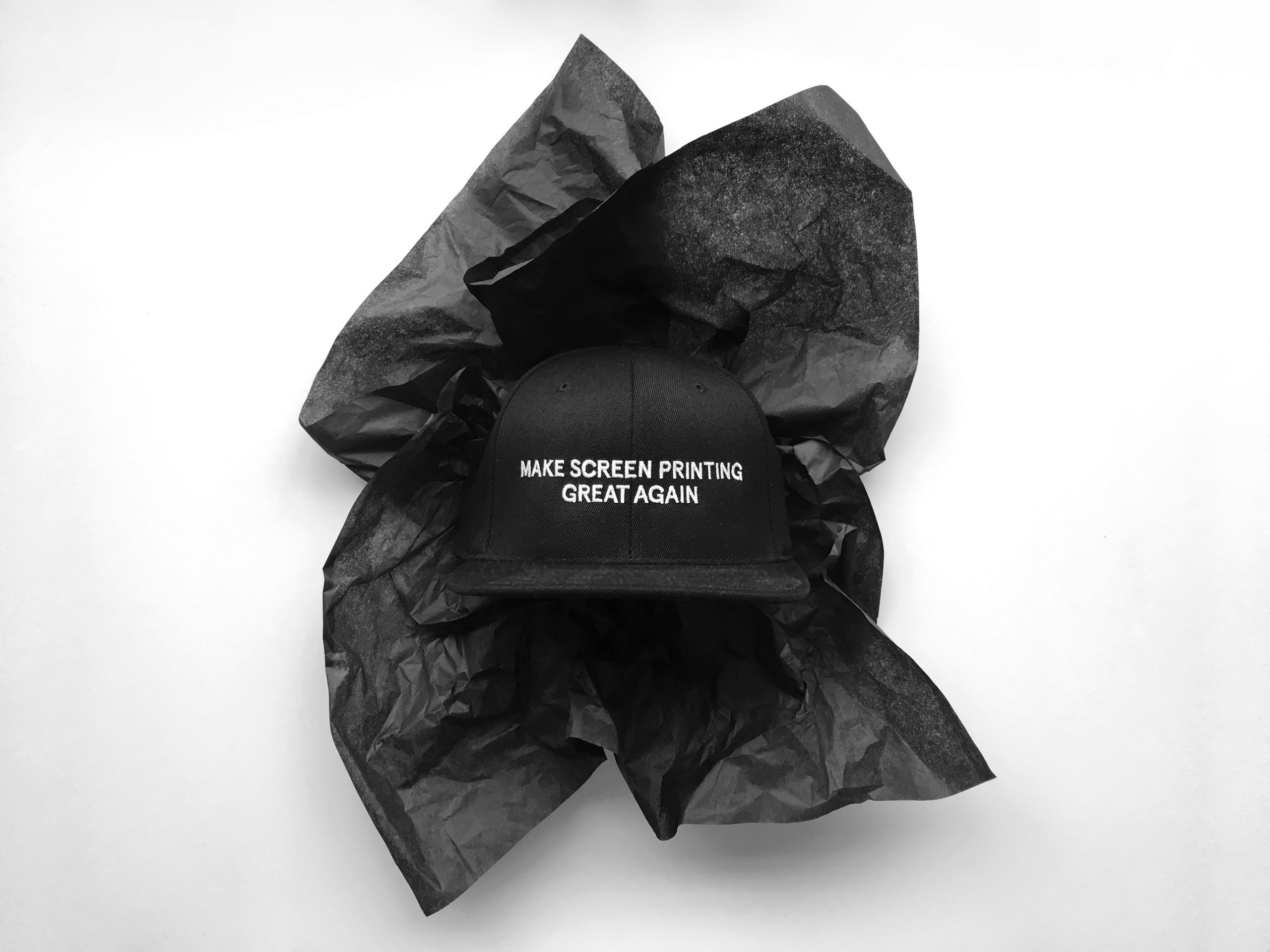
The old-fashioned field of screen printing has changed a lot through the years, and it needed a breath of fresh air. We adapted our design approach to the screen printing process. So we had to think about the direction we wanted to take for the branding of these 2 services. We even dare to realize our dream to bring this wonderful printing mode on the road… a first in Quebec, or even in Canada.


