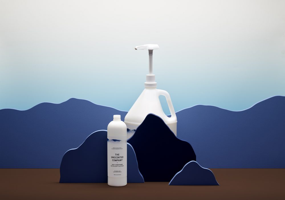
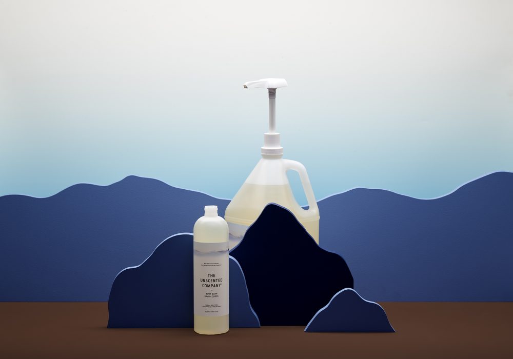
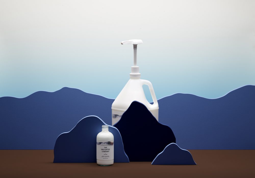
The Unscented Company
Mandate
Packaging
Label
Art Direction
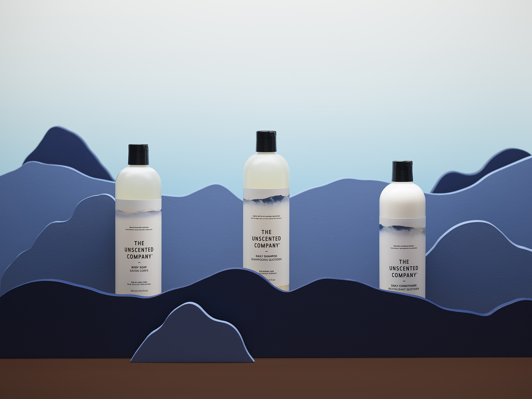
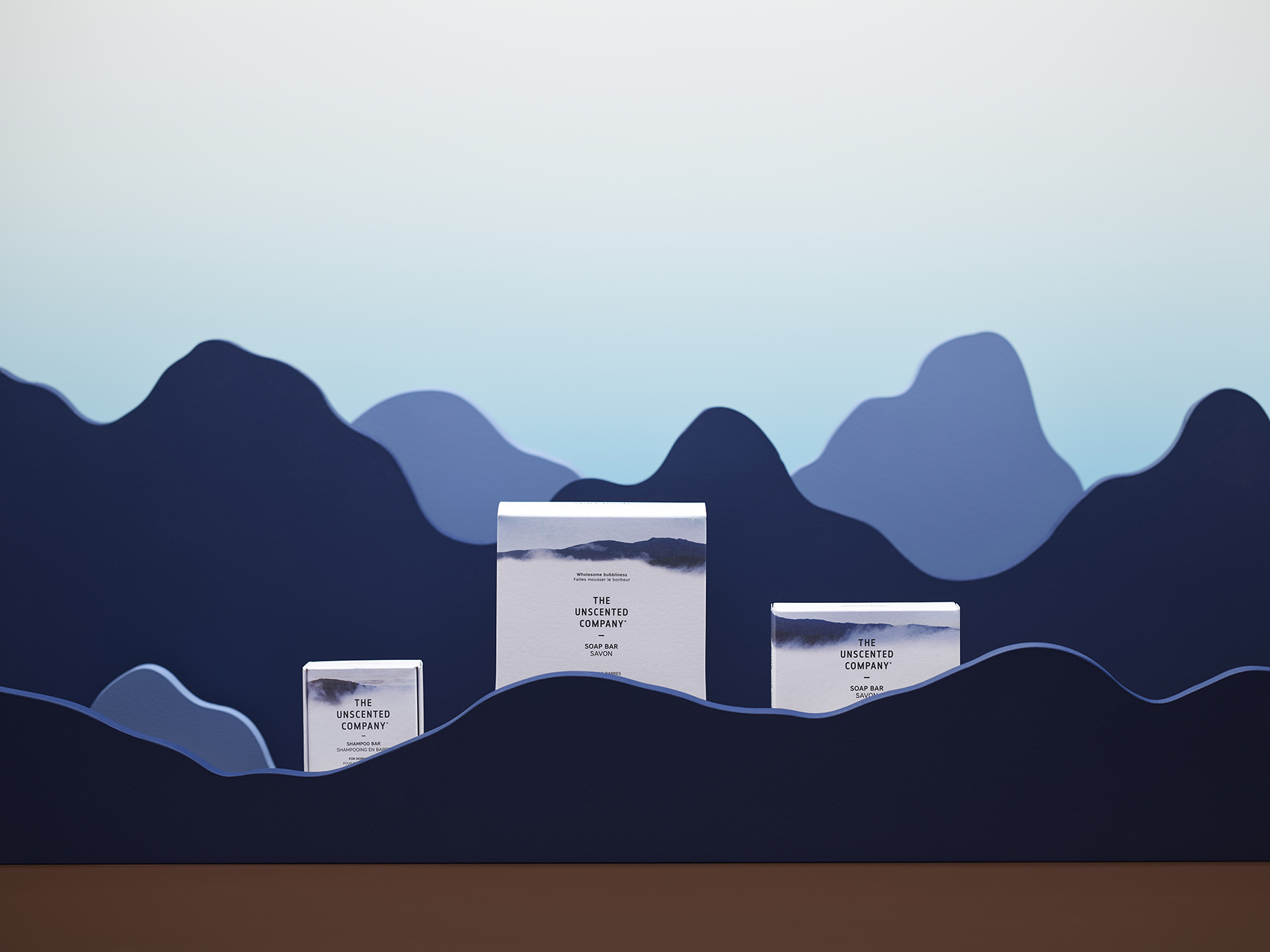
BANG. New body care products.
BANG. Fragmentation of a product family.
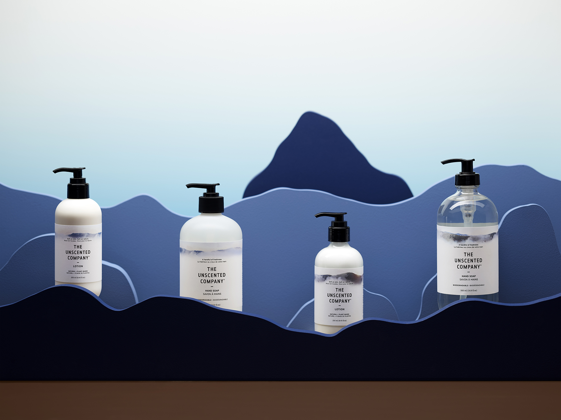
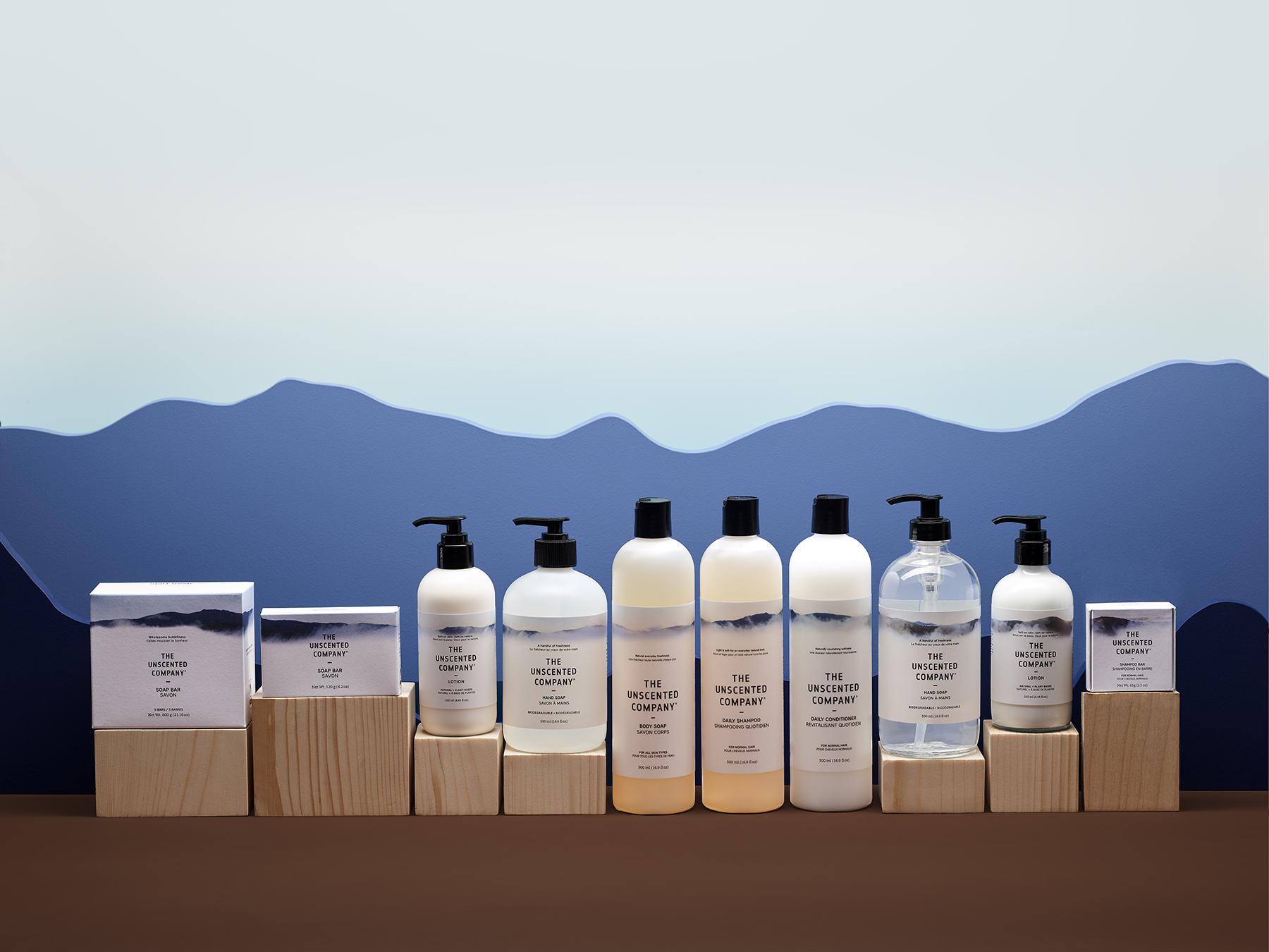
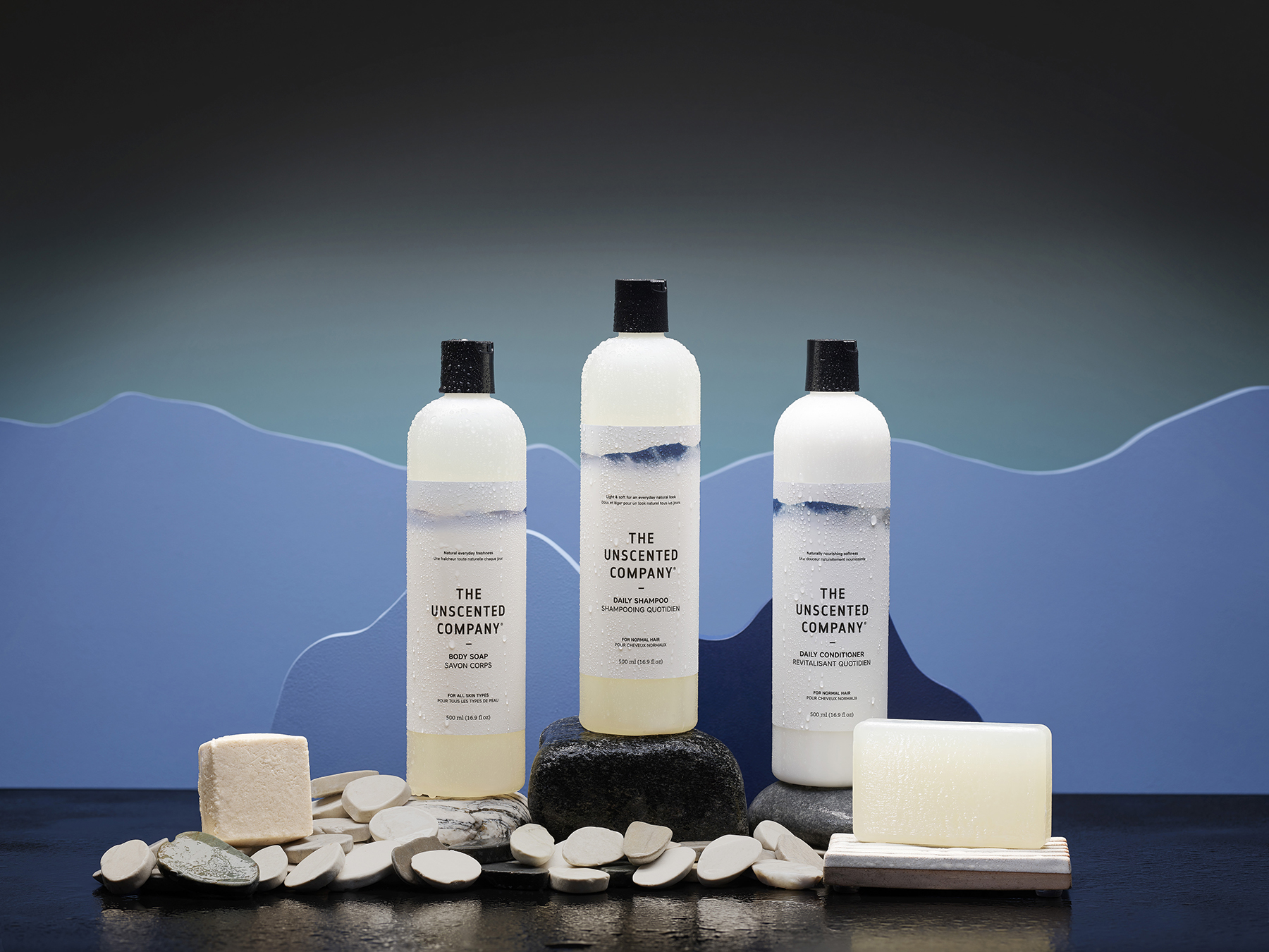
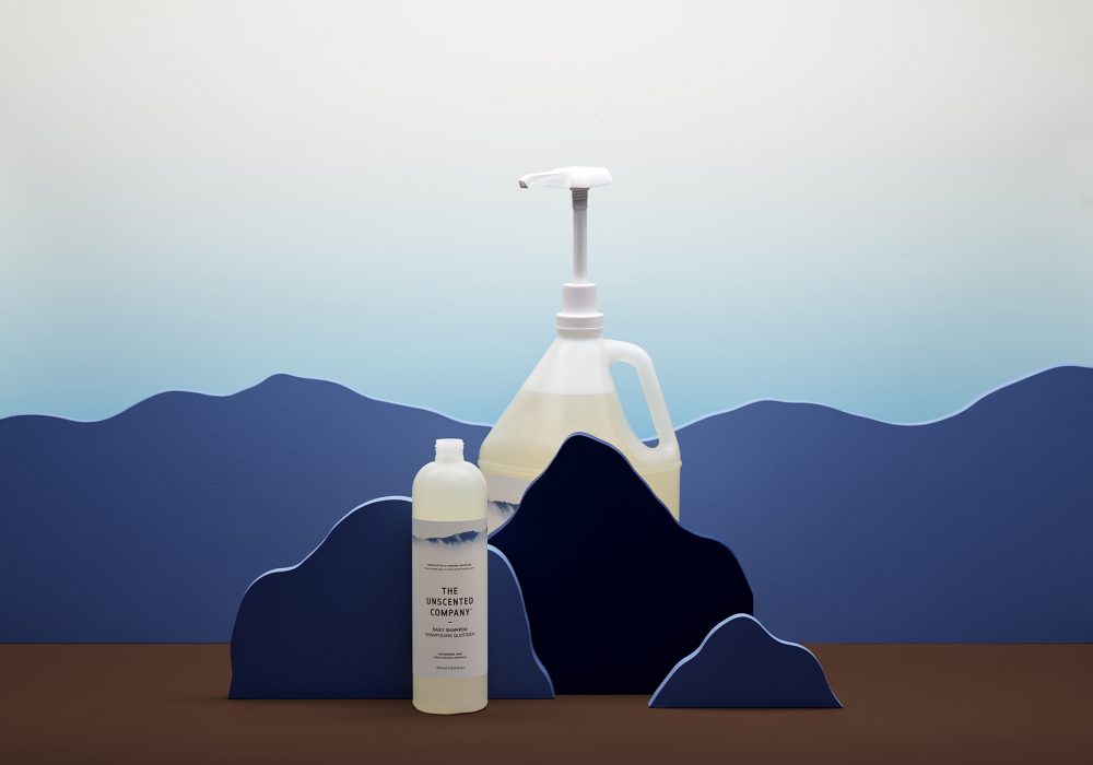
The Unscented Company (TUC) has once again trusted a design studio specialized in packaging. After expanding its product family in the last few years, the company wanted to spread out into two main product categories: Home + Body.
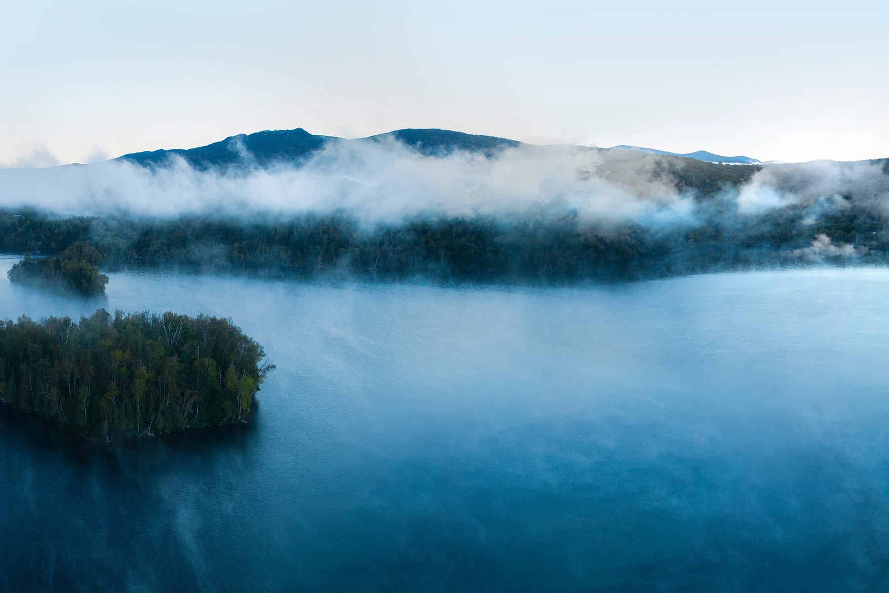
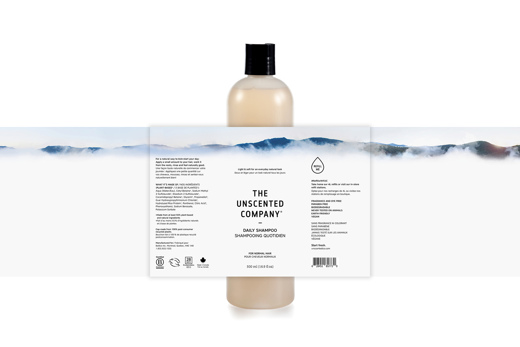
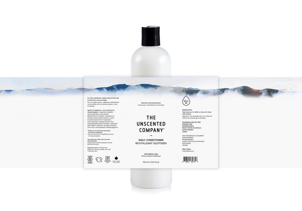
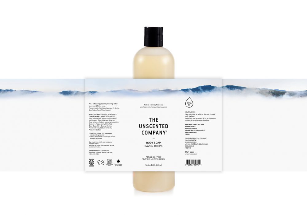
The objective was to fragment the large product family into 2 categories without visually altering the essence of the brand. Considering TUC’s values, we determined that the company has the mission not only to preserve water (the wave representing the “Home” category), but also to reduce its environmental impact beyond earth. Our thoughts then sailed between sky and earth before we came across Valérie Derome-Massé, a local photographer to whom we gave the assignment to create the new image that would represent “air” (the “Body” category). A peaceful mountainous landscape captured in flight by a drone caught our attention and has then been applied on over a dozen products. In stores, this new graphic line allows a clear distinction between TUC’s 2 product categories: Home + Body.
