Customer
Bang Bang 2017
Mandat
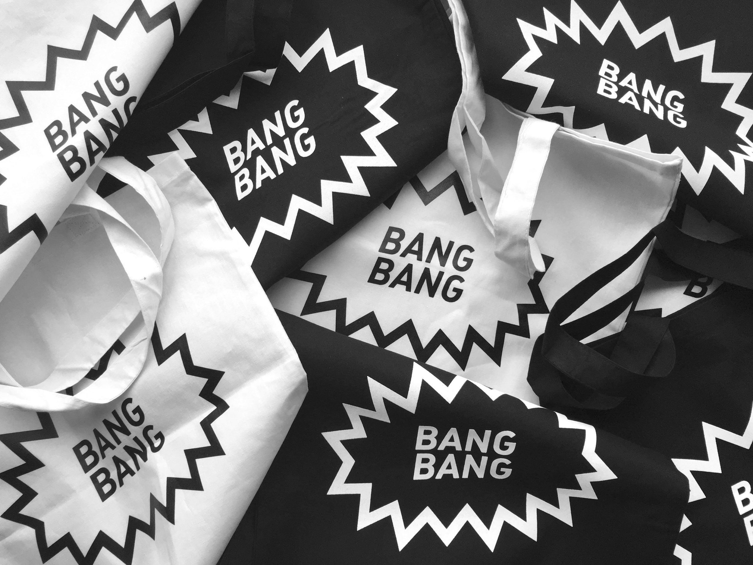
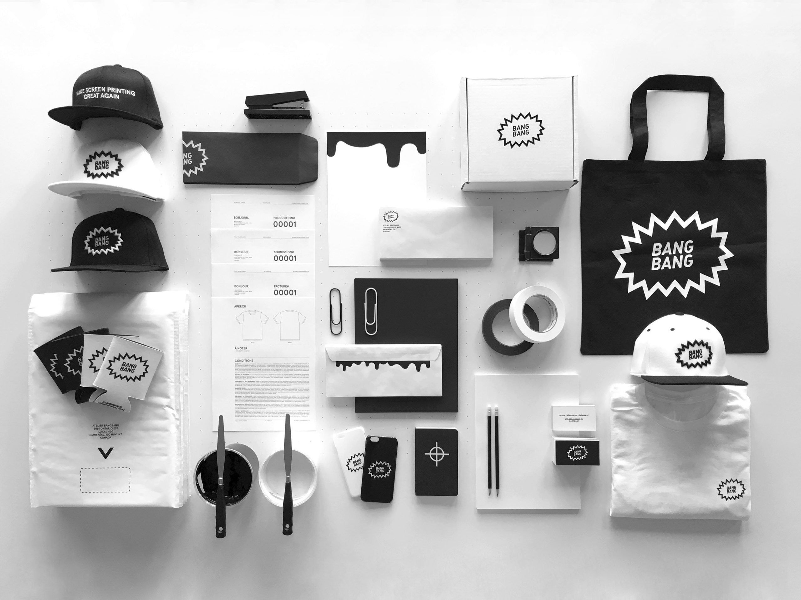
Visual identity
Artistic direction
Website
Prix
2x Applied Arts
BANG. A four-year history.
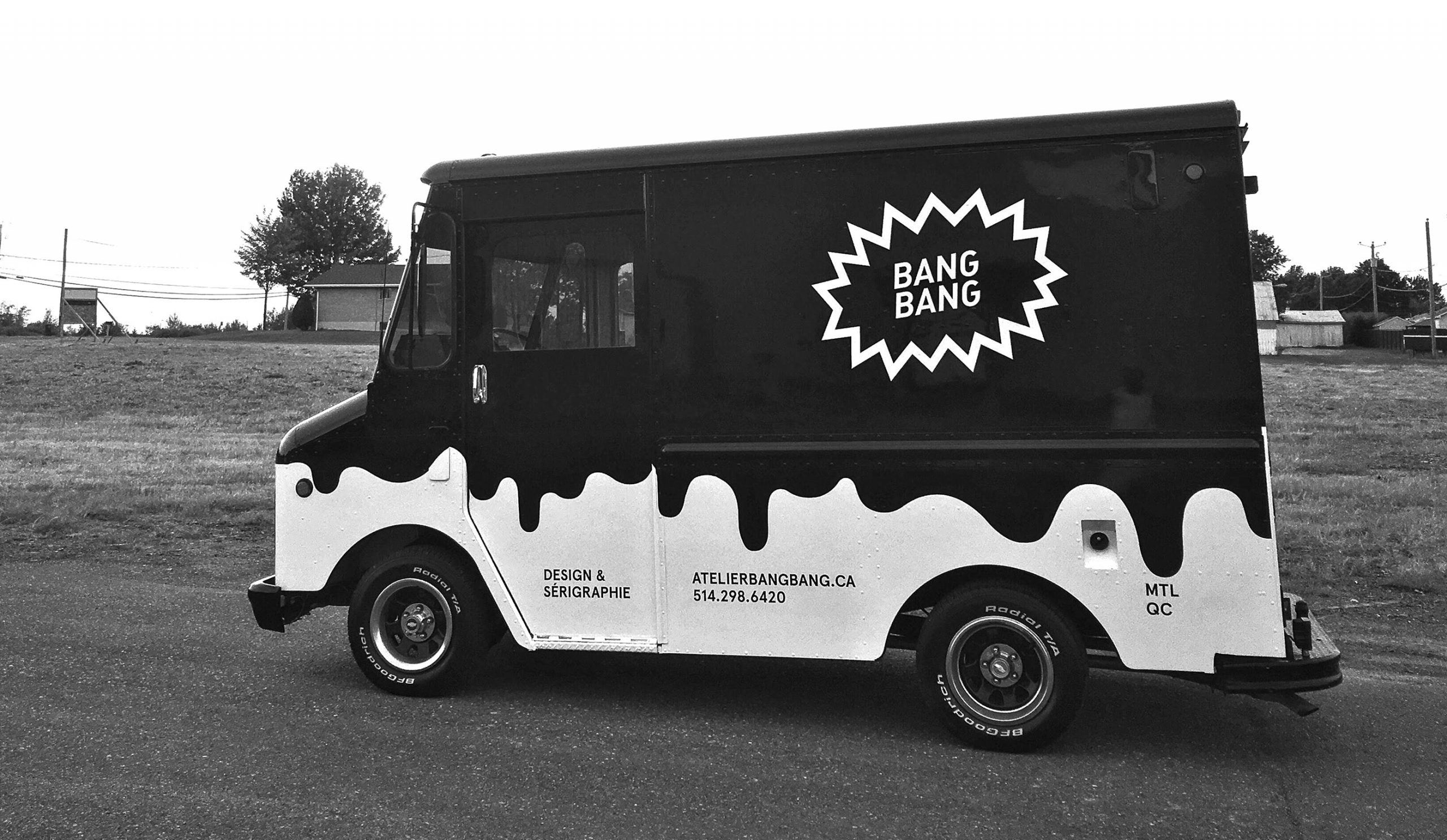
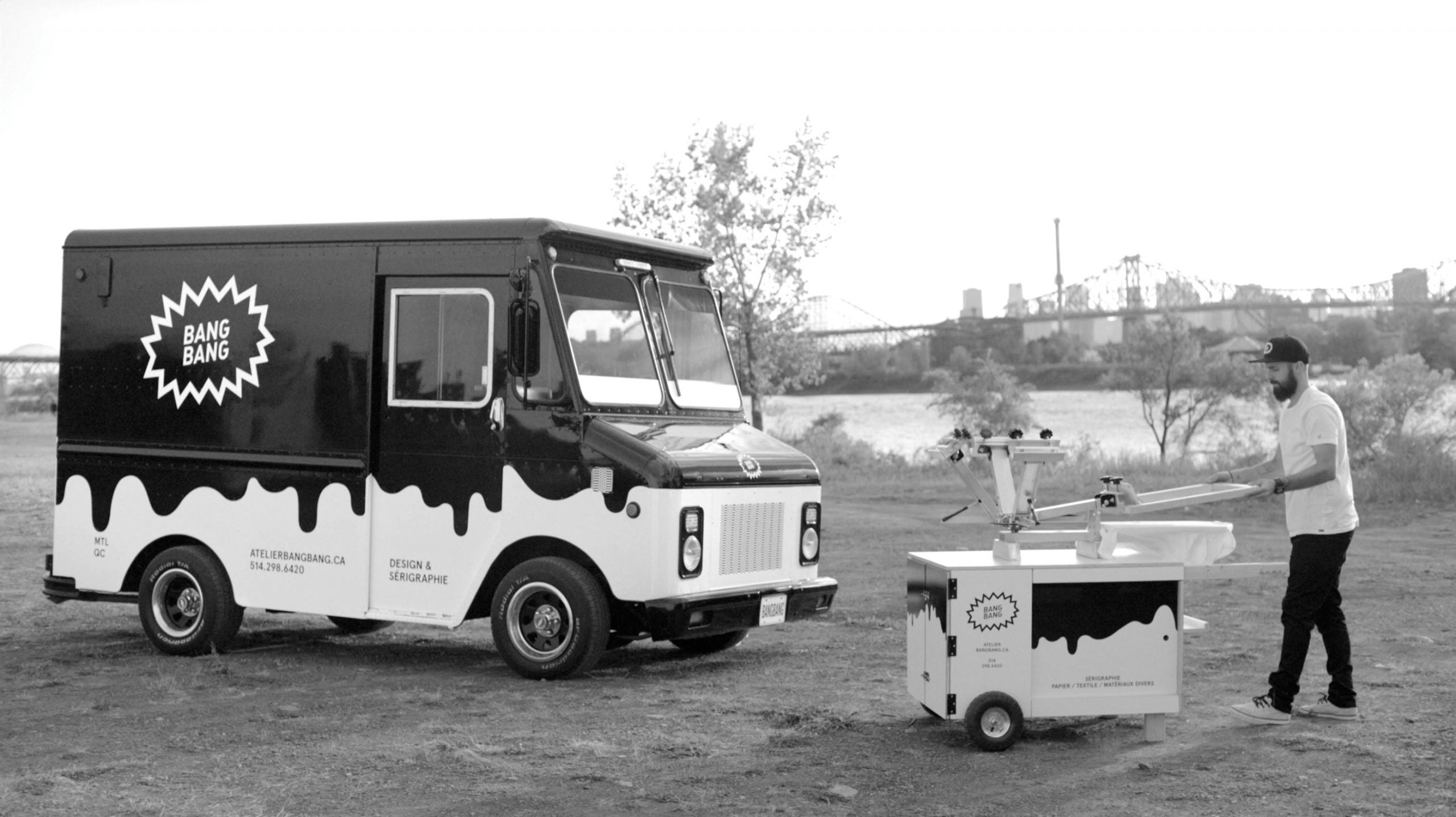
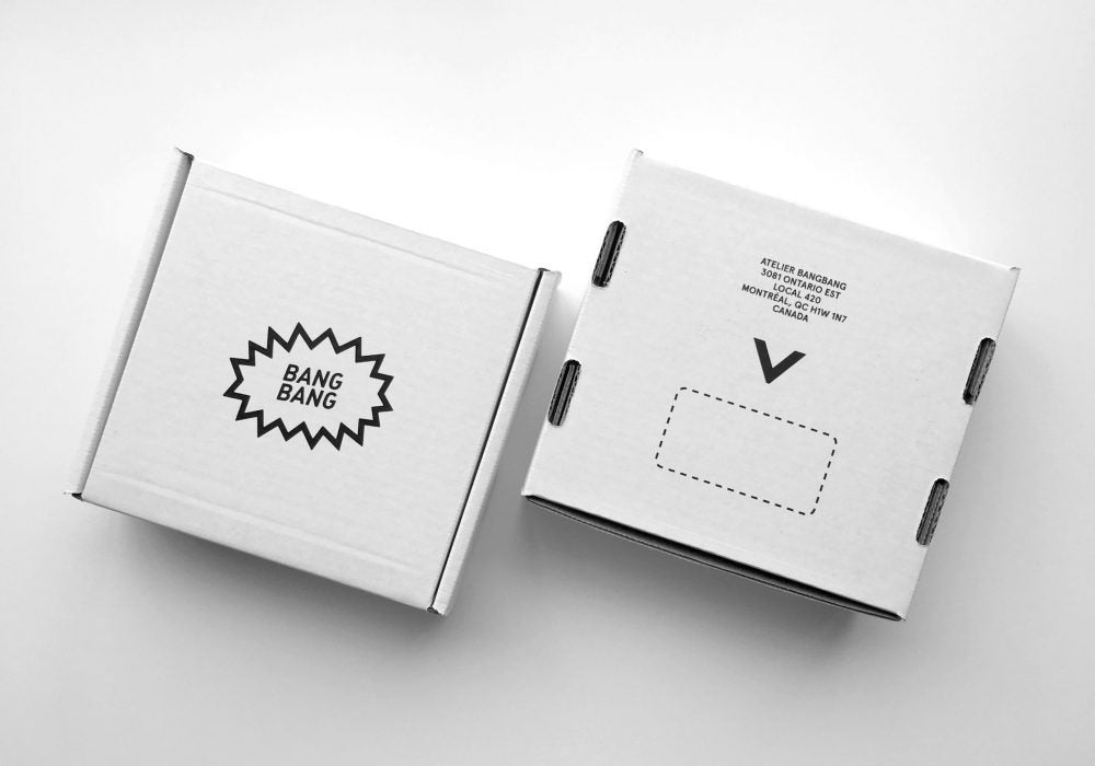
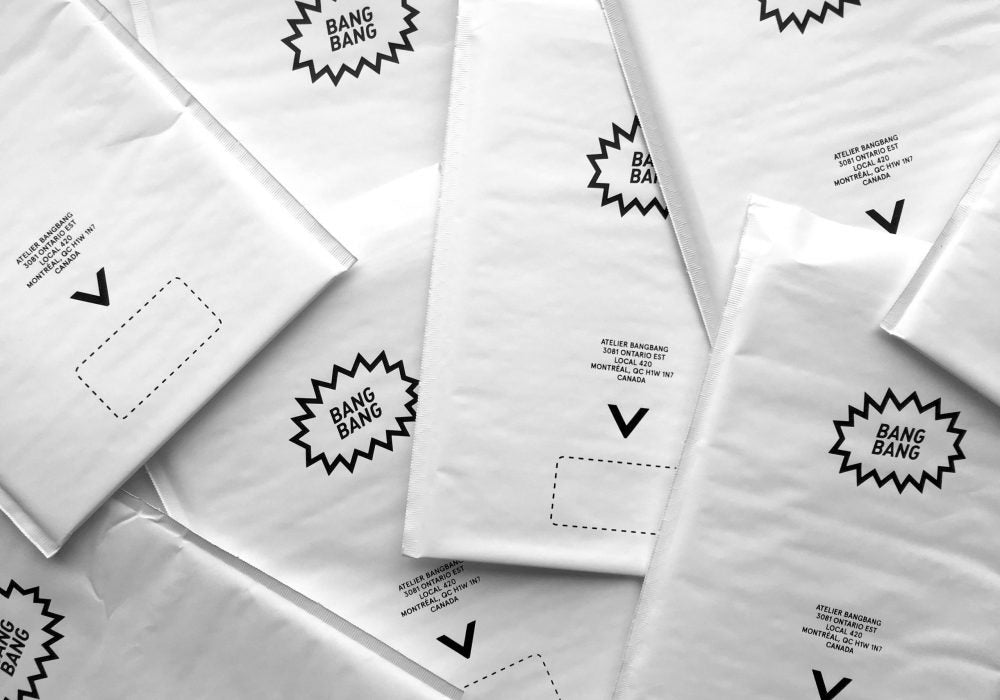
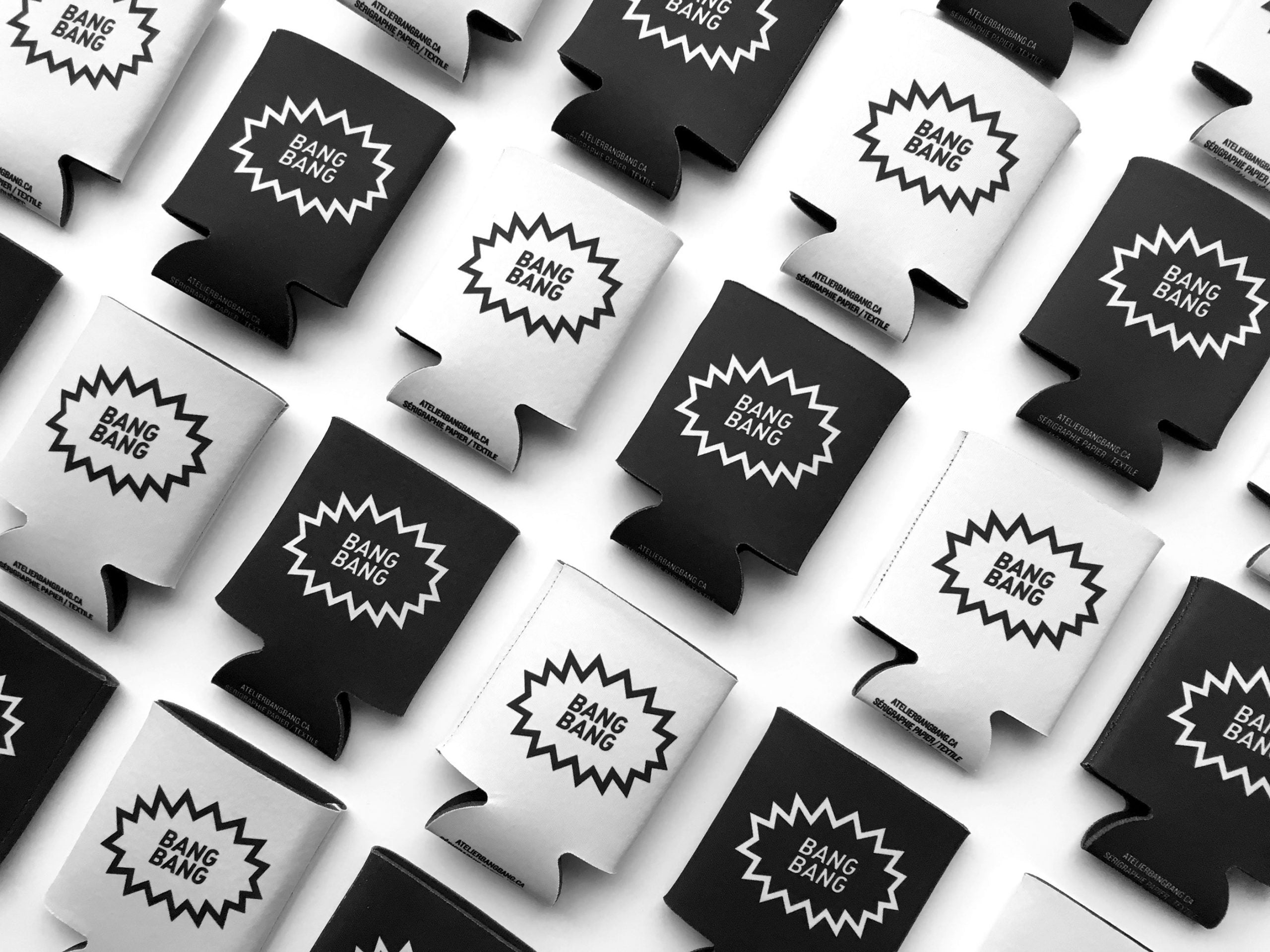
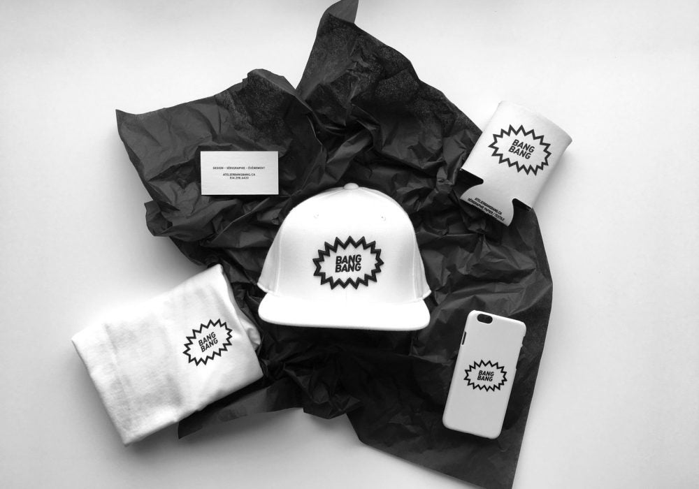
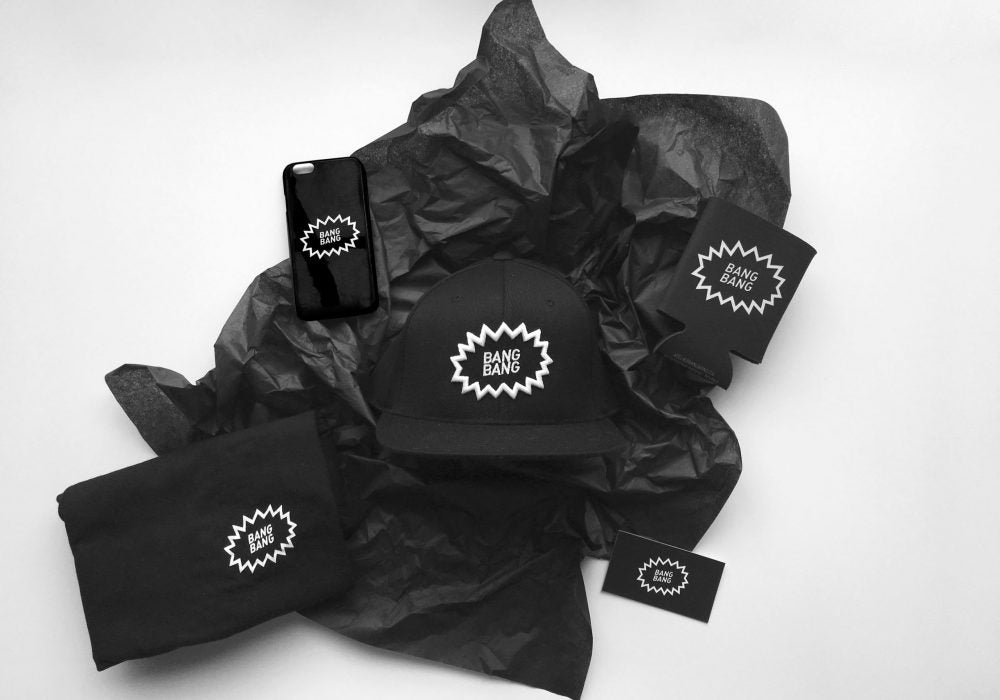
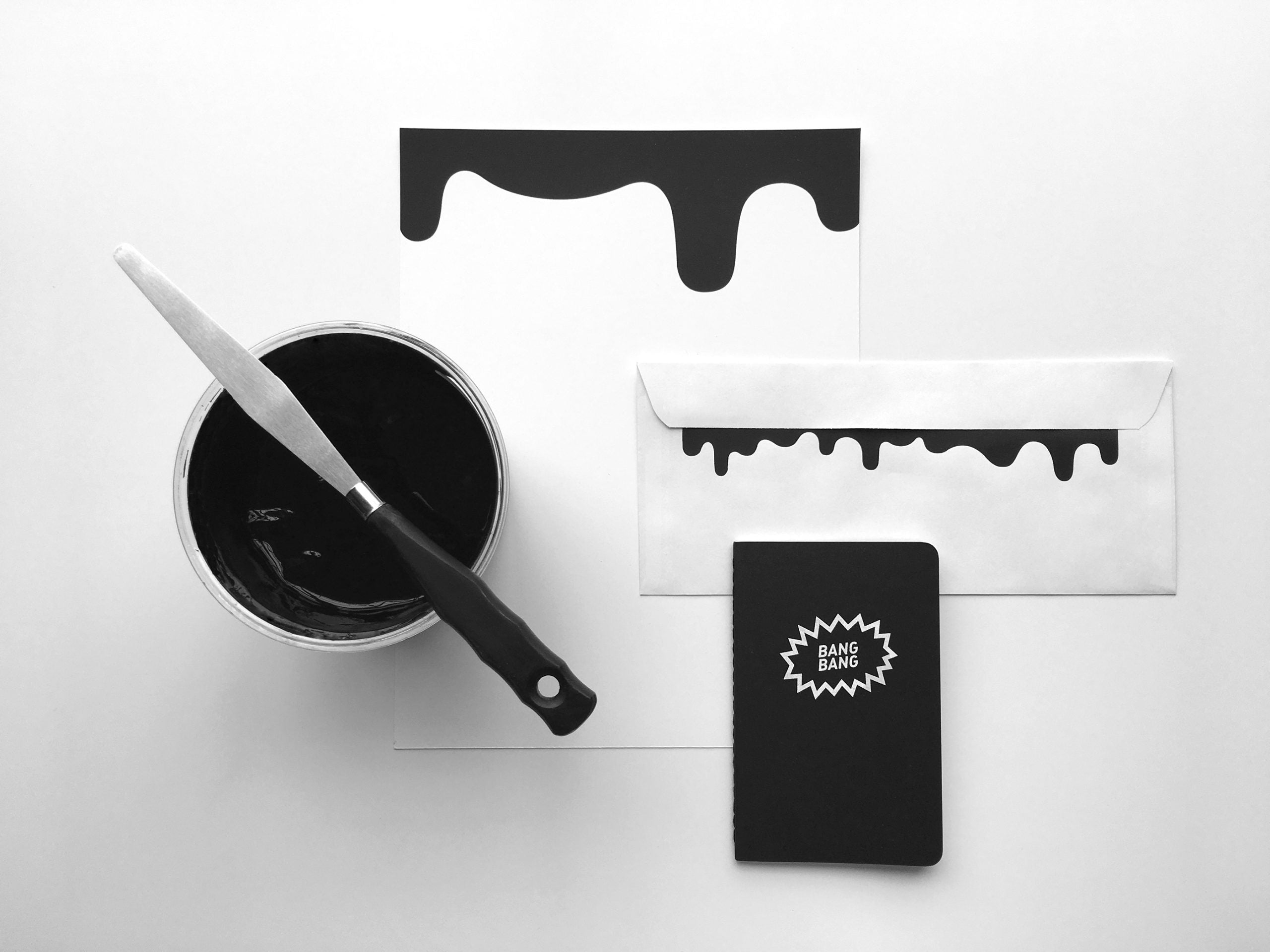
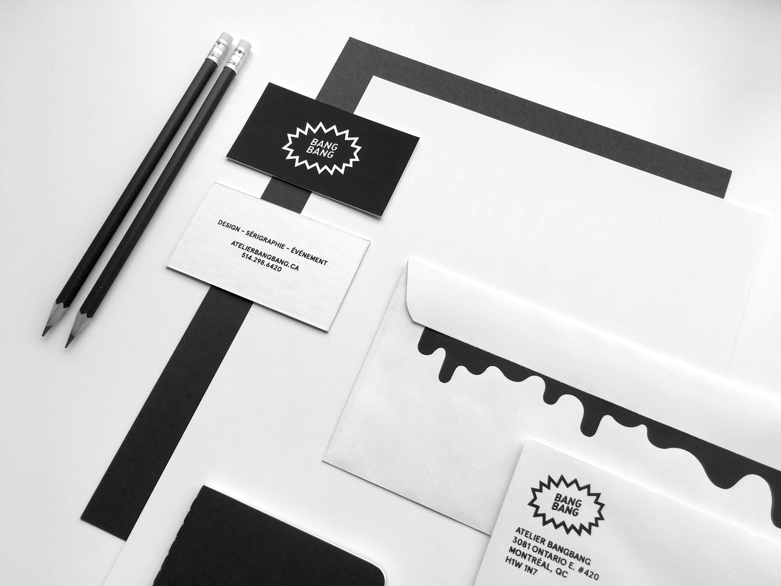
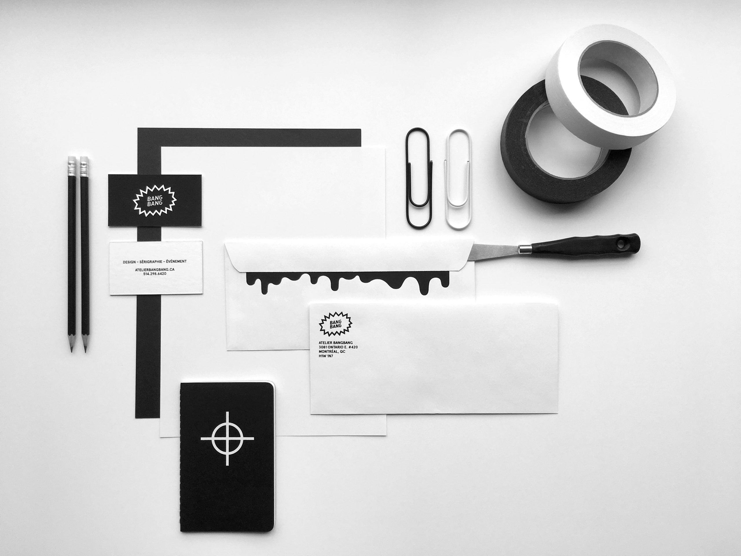
BANG. A rebranding.
After four years of existence, we've given ourselves a makeover by refining our identity. It's only logical that the company is now represented in black and white so that printing and creating client projects can give way to color. From stationery to textiles to the web, it's the promotional truck that seals the outcome of this refresh.
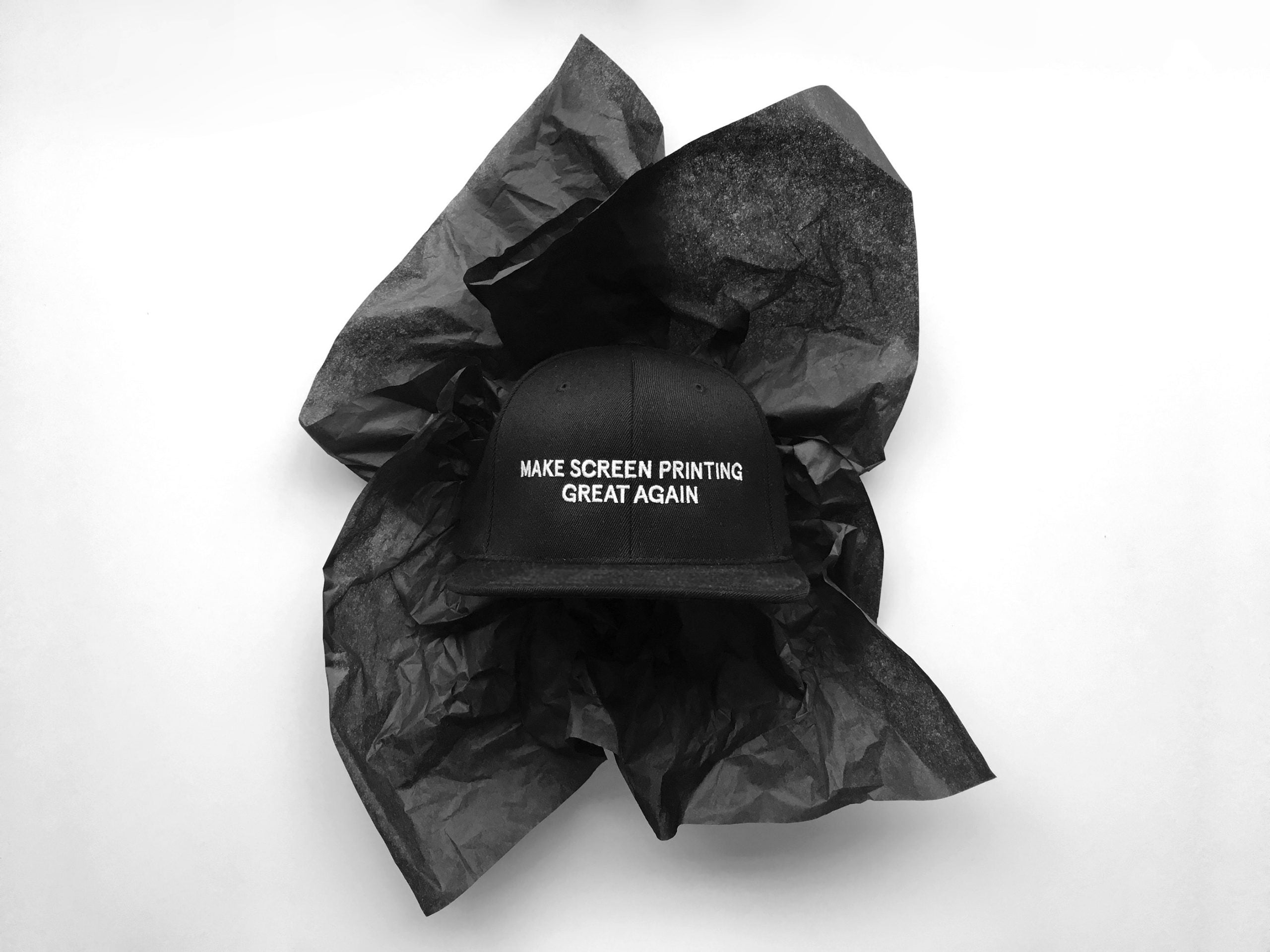
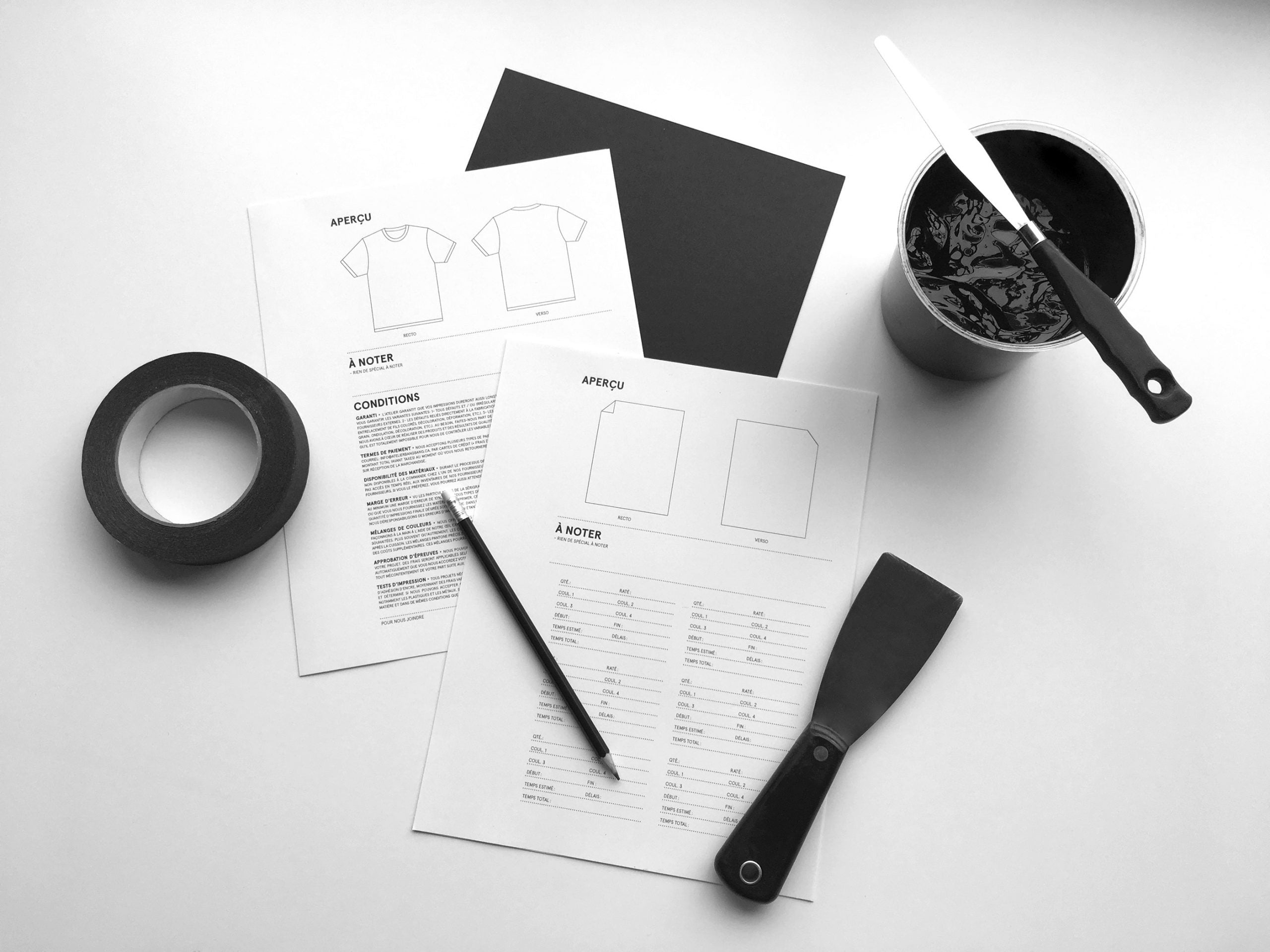
The dusty field of screen printing is no longer what it once was, and it really needed a breath of fresh air. Our design approach was essentially adapted to this printing method. We therefore thought about how the image would be conveyed and the direction of the variations for these two types of service. We even dared to realize a dream: that of now being able to convey this wonderful printing method... a first in Quebec, or even in Canada.