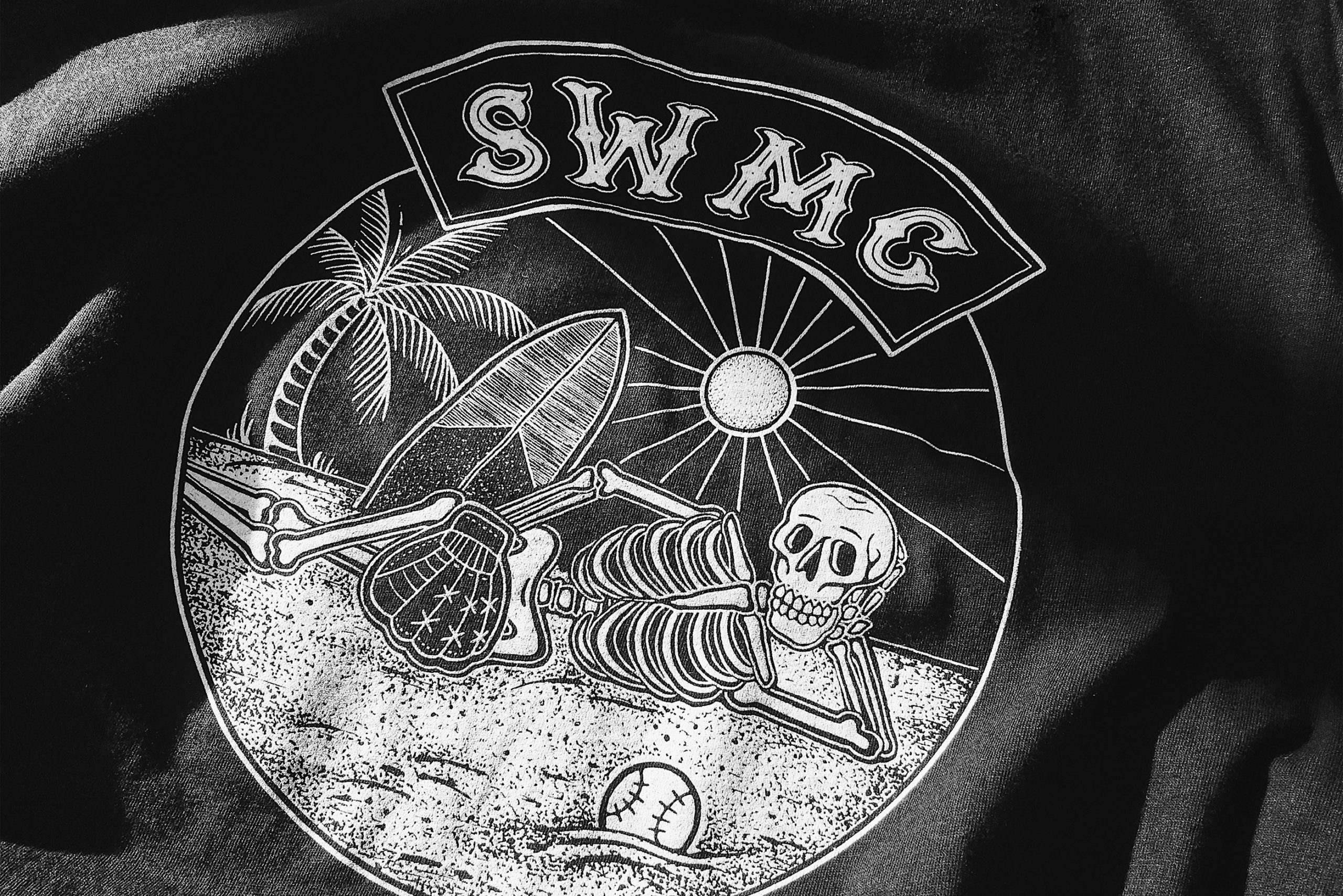
SWMC
Mandate
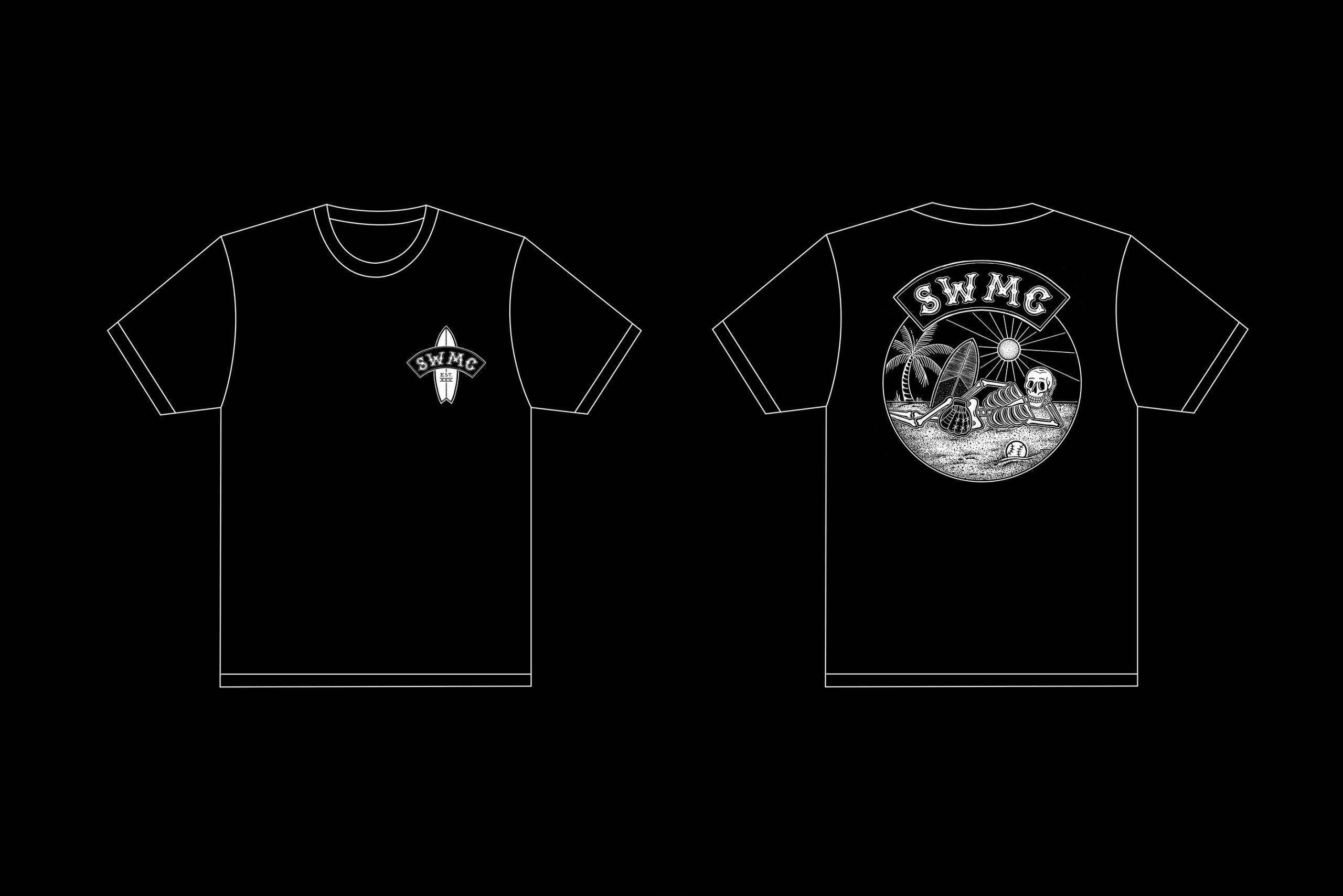
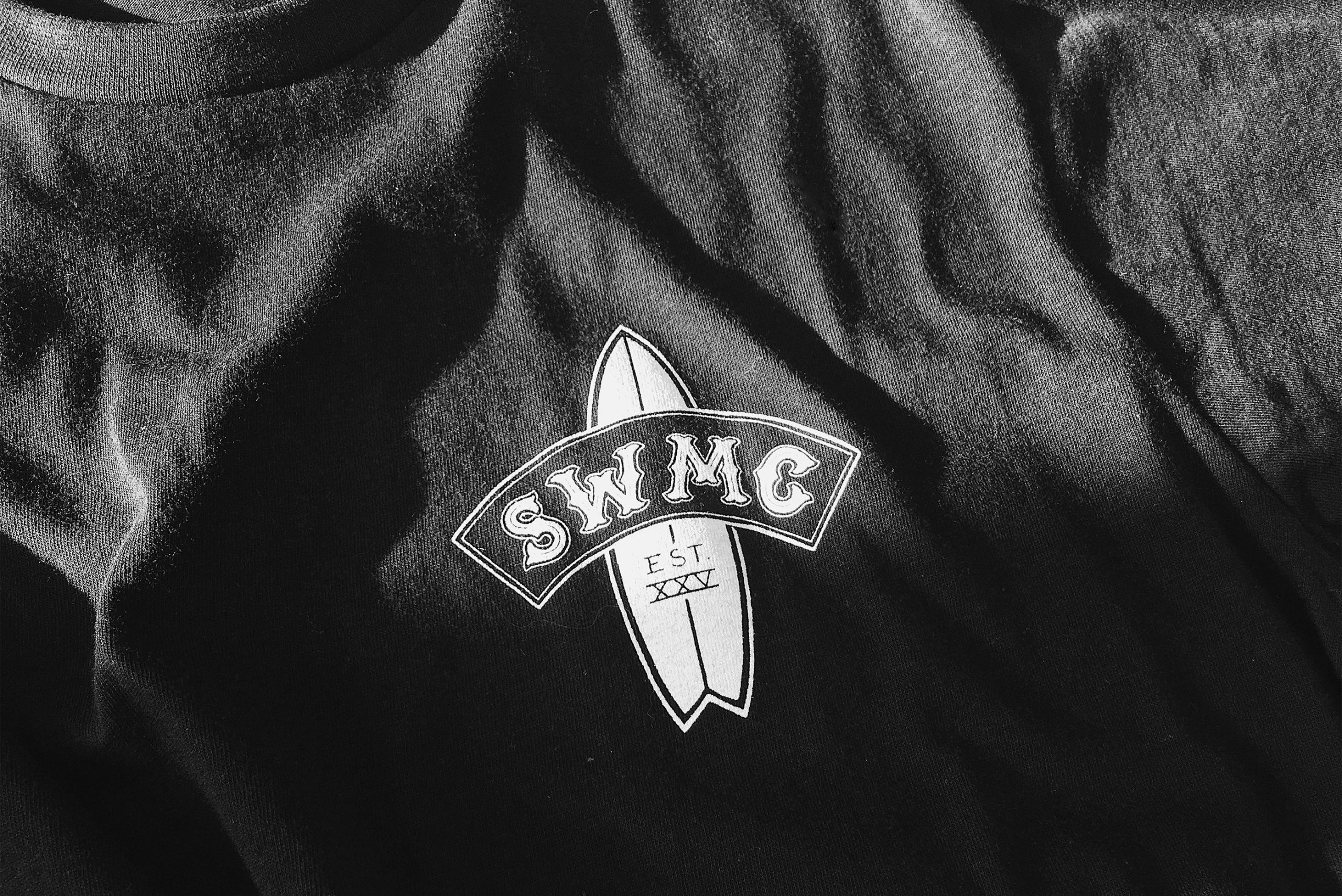
Branding
Screen Printing
BANG. An amateur softball team.
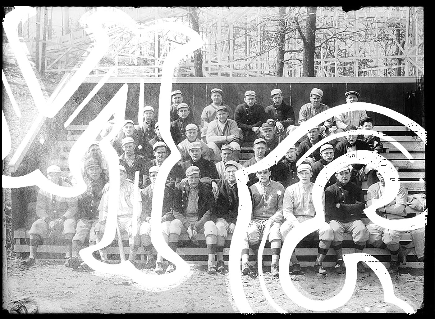
BANG. A uniting identity.
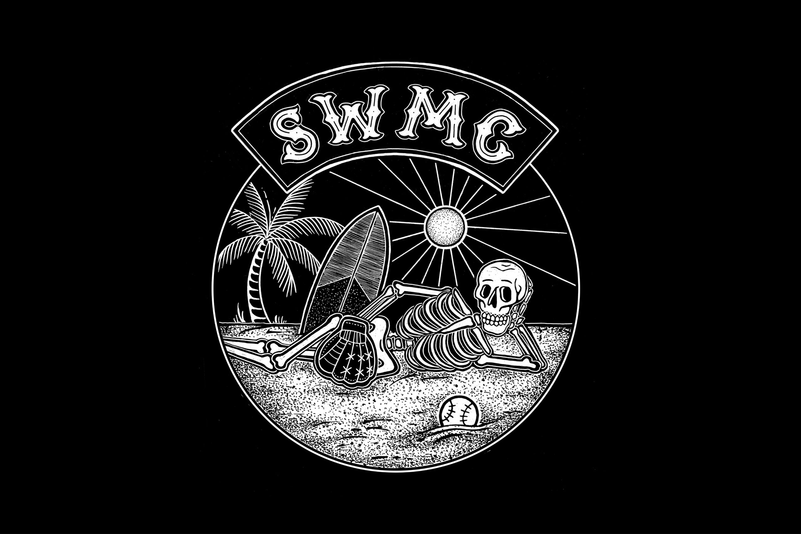
The SWMC has trusted a studio specialized in visual identity. Always ready to take up new challenges, the surf fanatic thrill seekers are used to face the extreme climatic conditions in Quebec. They wanted to create a new branding to represent their softball team.
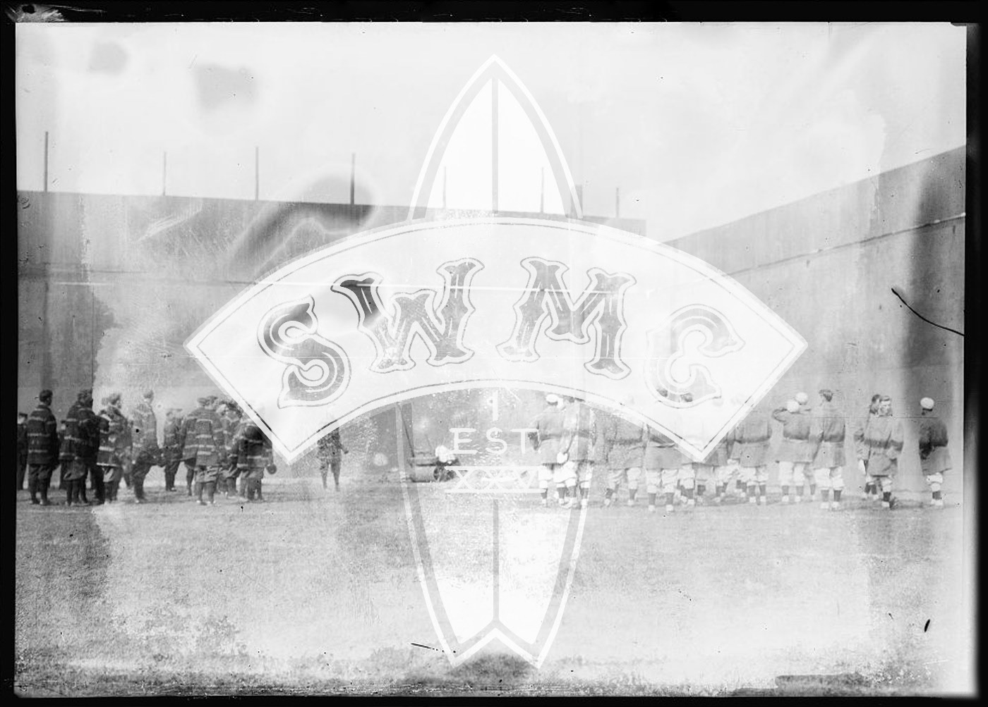
The objective was to design a visual identity that would remind us of motorcycle clubs’ symbols and to combine the two sports in a humorous and irreverent illustration style. We decided to work with Noémie Éclipse, an illustrator and tattoo artist from Montreal. She helped us create a crest inspired by the team’s name, the “Small Weiners Motorcycle Club.” The typography was designed to respect MC’s traditions in regard to the placing, the graphic style and the addition of the abbreviation “EST. 2010.” From now on, the team will be united, forever and ever!